Introducing the Romero Insurance website Relaunch
We’ve got a new look! Take a while to look around and read the pages which relate to you. The makeover is site wide, featuring faces of our team members and businesses we partner with. Many of our favourite new pages include:
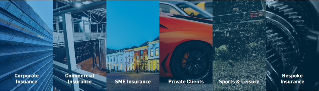
- Our solutions – Corporate Insurance
- Our solutions – Commercial Insurance
- Our services – Buildings and Contents insurance
- Our partnerships
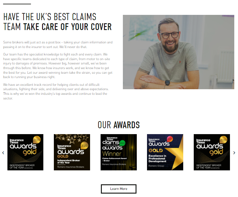
- Claims information
- Confidential Review information
Matt Dickerson – Senior Creative Artworker for Romero Insurance Brokers walks us through the new Romero website and what inspired this transformation.
Matt spearheaded this change, aiming to make the Romero website more modern, fluid and functional. His trademark style of large images and effective use of white space shines through, as does the Romero swashes of cerulean blue. A continuation of real people who make up the business are proudly displayed throughout, as are businesses that Romero has strong ties to, they remain visible and identifiable; showcasing Romero’s story.
All in all, the new Romero brand takes all the positives of the last iteration, and builds it within a new, more functional, system.
Dynamic Branding
“The Romero brand has always been dynamic, leading the way in the insurance space, by adopting modern marketing methods and styles. Our brand reflects the approach of our team members; forward, productive, positive. This new website relaunch represent the progress Romero has made in the last three years.”
“In everything we do at Romero, we aim to set a benchmark for the sector. Through our work ethic, our wellbeing initiatives, our client claims support and now through our branding. “
“As an award-winning broker, Romero deserve an award-worthy website. The structure and rigidity of the past template did not allow the marketing and prospecting departments to fully push their message in the way they want. With this new design, and all the dynamic moving parts, there is much more flexibility.”
Through the team’s creativity and with Matt’s experienced eye overlooking the changes, Romero’s website relaunch is another step toward setting ourselves apart from the competition.
New Building Blocks
The new Romero website has been built within a different engine. This CMS allows far more freedom, not following the rigid template of the last iteration.
Matt says: “The new building blocks and elements I’ve designed incorporate more whitespace. The website feels breathable and uncluttered, whilst still providing all the valuable information. This makes the website far easier to use and to understand for clients.”
These changes are best seen through our new Confidential Review page. This page utilises floating assets and whitespace to great effect, laying out quite a complex process in simple terms.
“Sometimes insurance can seem overly complicated. The website’s mission is break down information and transfer it efficiently – this is done best through intuitive design, that is both recognisable and distinct.”
Clients at the heart of our brand
Matt continues: “As a dedicated Brand and Marketing department in the industry, we have a comparatively unique way of working – as do Romero when looking across the insurance sector. I wanted to translate this uniqueness, as well as the expertise we hold, by moving slightly away from the tried-and-tested mould.”
“The new user interface is far easier to use. UX design is really important to us, helping clients get to where they want to be. We’ve streamlined the navigational bar, making getting around the website far simpler. The navigational bar encompasses everything that makes up the Romero business model, from the industries we support, to the services we provide, to the partners we work with.”
“Time spent on the site needs to reflect what it’s like to work with Romero Insurance as a client; streamlined, organised, professional. The current trend in modern website design is to adopt assets that are popular to mobile users. We provided large buttons, distinct sections and reactive sliders to appeal to this audience.”
“Furthermore, we understand that making and reporting claims is time-sensitive. Which is why we’ve added an emergency motor claims page. The home page is far more straightforward, taking inspiration from our recently revamped client brochures. Clients can now access most of the website directly from the Romero home page.”
We hope you like what you see, and if you have any questions about the changes we’ve made, don’t hesitate to get in touch.